A couple of days back (for vague values of "couple", of course), first of the month, having my morning coffee, I go and open my bank's mobile app to move a bit of money about and pay a couple of things. This happens every month. This is so routine I do it almost on autopilot.
Yeah, yeah, I know, it's banking, pay attention! But still... morning, coffee, routine.
I get to the final movement/payment and then notice something:
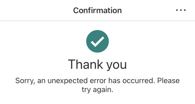
That.... that text! WTF? So then I look back at my payment history and notice that all but one payment hadn't gone through! O_o
This alone is fine. Stuff happens. Things fail. I'm okay with that. It's an inconvenience for sure but doubtless whatever the problem is will be fixed and I can make the payments again later. But...
That result. There's a tick. A GREEN tick. And a "Thank you". It's natural to see that image, know that it's always meant "shit worked" and just carry on.
In one of my systems at work there's a tool I wrote for checking a repository of code to make sure it conforms to a certain standard. When folk use it they get a night big, bold and bright green thumb-up above the text that says everything is cool. If there's a problem, any sort of problem at all, then the display is red and there's no jolly icon and it's obvious that things are different and you likely want to pay attention to the explanation of what isn't right.
This isn't news, of course. This isn't some revelation about UI design or anything. We know this stuff. I think what boggles my mind a little bit about this is that something as important -- and hopefully by this point as mature -- as a mobile banking app should get something as obvious as this right.
But here we are, with a nice friendly green icon showing a tick and a friendly big "Thank you" followed by smaller text going "aye shit didn't work pal".
Have a comment or query about this post? Feel free to drop me a line about it.