Encouragement, I guess?

Posted on 2023-07-21 08:20 +0100 in Life • Tagged with UI, UX, health, fitness • 1 min read

Anyone who was (un)lucky enough to follow me on Twitter back in 2020 will know that, starting January 1st that year, I set about losing weight. At the time I was very overweight and wanted to get into some sort of healthy state. By August that year I'd managed to drop 30kg and hit and then went a wee way under my goal.

These days I'm back up a wee bit. Not much: generally about 5kg or so above that goal, most of that having turned up on the last 7 or 8 months (not exactly coincidental that it's happened in conjunction with the new job, the new work location, and the new commute). While it's no real cause for concern -- I'm still generally careful and still get plenty of exercise (normally walk around 35km a week, run 20km, get my 10k steps in every day)

About a week back I decided that it was time to give myself a bit of breathing room, to try and at least drop a couple or kg; so with that in mind I set a lower daily calorie goal in my tacking app.

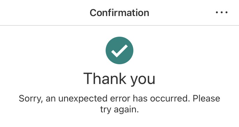
When recording my weight first thing this morning (yes, I'm one of those people who records it every day and have for a few years -- it makes for interesting data!), this is what my calorie/stats tracker had to say:

Screenshot of my calorie and weight tracking app

I guess it's putting a positive spin in things? (for the record, I'm 5.3kg above my absolute goal).


Failed successfully

Posted on 2022-06-03 09:05 +0100 in Tech • Tagged with UI, UX • 2 min read

A couple of days back (for vague values of "couple", of course), first of the month, having my morning coffee, I go and open my bank's mobile app to move a bit of money about and pay a couple of things. This happens every month. This is so routine I do it almost on autopilot.

Yeah, yeah, I know, it's banking, pay attention! But still... morning, coffee, routine.

I get to the final movement/payment and then notice something:

Useless error message

That.... that text! WTF? So then I look back at my payment history and notice that all but one payment hadn't gone through! O_o

This alone is fine. Stuff happens. Things fail. I'm okay with that. It's an inconvenience for sure but doubtless whatever the problem is will be fixed and I can make the payments again later. But...

That result. There's a tick. A GREEN tick. And a "Thank you". It's natural to see that image, know that it's always meant "shit worked" and just carry on.

In one of my systems at work there's a tool I wrote for checking a repository of code to make sure it conforms to a certain standard. When folk use it they get a night big, bold and bright green thumb-up above the text that says everything is cool. If there's a problem, any sort of problem at all, then the display is red and there's no jolly icon and it's obvious that things are different and you likely want to pay attention to the explanation of what isn't right.

This isn't news, of course. This isn't some revelation about UI design or anything. We know this stuff. I think what boggles my mind a little bit about this is that something as important -- and hopefully by this point as mature -- as a mobile banking app should get something as obvious as this right.

But here we are, with a nice friendly green icon showing a tick and a friendly big "Thank you" followed by smaller text going "aye shit didn't work pal".