macOS desktop widget switching

Posted on 2024-04-17 09:26 +0100 in Tech • Tagged with macOS, fish, shell, streaming • 2 min read

When desktop widgets first turned up in macOS I was pretty quick to embrace them. On my personal Mac Mini I use a pair of screens, the right one mostly given over to Emacs, and there was generally room to space there. These days that screen generally looks something like this:

The usual layout of my right screen

Recently I've got into streaming while I do some coding and it's the right-hand screen that I work on and capture using OBS. When I was setting this up I realised that the widgets being there could be a problem; not because they could distract or anything, more that they could, at times, contain sensitive information (there's my reminder list and my calendar there after all).

What I needed was a quick method of hiding all the widgets, and showing them again later, without it being a lot of faff.

With a little bit of digging around on the net I finally came up with a pair of fish abbreviations that do just the job!

abbr -g widoff "defaults write com.apple.WindowManager StandardHideWidgets -int 1"
abbr -g widon "defaults write com.apple.WindowManager StandardHideWidgets -int 0"

Now, when I'm going to stream, part of my "getting stuff ready to go live" checklist is to run widoff in the terminal; once I'm finished I can then just run widon again to have them come back.

Fast, clean, handy.

I've also got a pair for when I'm using Stage Manager:

abbr -g smwidoff "defaults write com.apple.WindowManager StageManagerHideWidgets -int 1"
abbr -g smwidon "defaults write com.apple.WindowManager StageManagerHideWidgets -int 0"

Although, really, I can't remember the last time I used Stage Manager. I dabbled with it for a wee while, found it vaguely handy in a couple of situations, but it doesn't seem to have stuck as part of my workflow or work environment.


Steam Deck

Posted on 2023-12-14 16:47 +0100 in Tech • Tagged with gaming, Steam, Steam Deck, hardware • 4 min read

Back in 2021, I think it was, when Value first announced the Steam Deck, I was all "hell yes sign me up!"; like... really, I signed up there and then to go on the waiting list. The idea of a wee device that would let me play a ton of games in my Steam library seemed like a great idea. The price seemed right too.

So, I signed up, and waited, and waited, and life moved on.

When I finally (I think it was the best part of 18 months later?) got the email saying my Deck was up for grabs and did I want to complete the purchase I... said nah. By this point I was so heavily into VR gaming that mucking with stuff on a Deck didn't seem to make much sense to me any more.

I moved on.

Then a few weeks back they announced the OLED version and I took a second look. There was now over a year of reviews to read, hacks to notice, fun to follow; now I could get an idea if a Deck was any good and if it was for me. So after a bit of review-reading and review-watching, Thursday last week, I slapped down an order; and by Tuesday the Deck turned up.
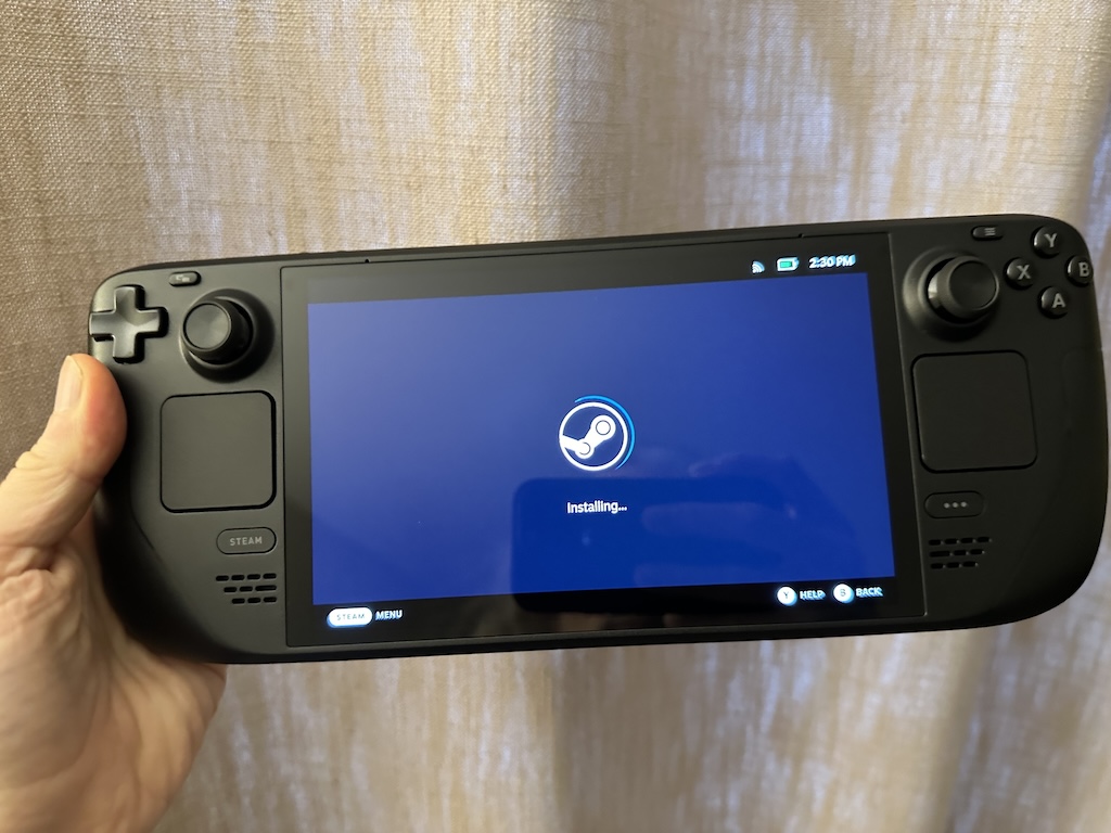
New Deck getting going

The overturning of my original decision to not buy came down to a couple of things. The first was: I recognised that there were a lot of games in my library, sometimes things I'd bought (often in a sale), sometimes things I'd got as part of a Humble Bundle, that just never got played. This, I noticed, was sort of down to an unfortunate relationship I'd developed with gaming.

See... VR has won me over. I love gaming in VR. Also, I love recording my gaming sessions and throwing them on YouTube. This means that, to some extent, in my head, there's effort to getting going with playing a game: I've got to power up the Windows PC; I've got to let it update stuff; I've got to let Steam update stuff; I've got to power up the VR headset; I've got to get it to connect to the PC (which generally works fine but on occasion needs a complete restart of everything); I need to decide what I'm playing next and what to record; I've got to get the recording software going; I've got to...

You get the idea.

Also, of course, I've got to be in the right state to be okay with having a computer strapped to my face (sometimes you don't feel 100% and being lost in a virtual world isn't the best thing to be doing).

This can feel like too much effort. It also means that gaming tends to be left for when I've got a few hours to dedicate to it.1

But I also love playing games.

My thinking then was a Deck would be a great way of "forcing" myself to play the more casual stuff. There's no easy (that I know of) way to record or stream from the Deck; it's also easy to have it on the sofa and turn it on in a moment. This felt like the ideal device to have to hand, that was dedicated to gaming, and which would encourage me to take smaller gaming sessions when the time arises.

Like... sometimes I'll put something on to cook, come into the living room, pick up the tablet and scroll through the Internet. While I try not to doom-scroll too much, I can see that it would be more healthy to pick up the Deck and play DooM!

So far, two days in, I'm convinced this was an excellent idea and I'm totally won over.
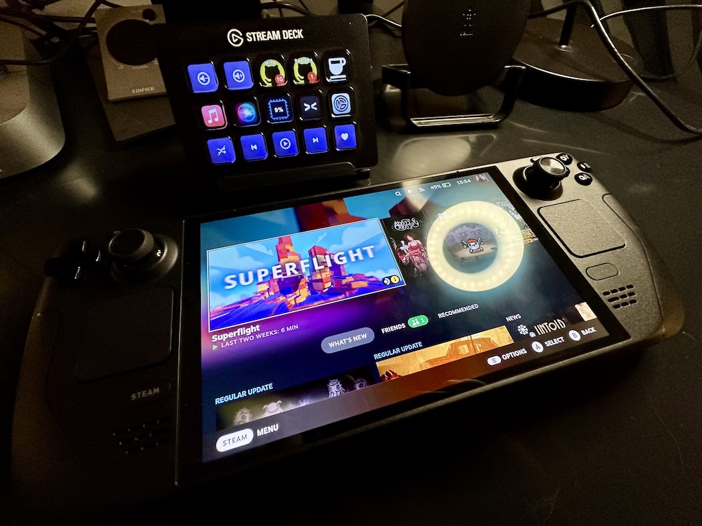
My Steam Deck and Stream Deck

I'm still getting a feel for what does and doesn't work best on the Deck, from a "my taste in games" point of view, but things that allow for dipping in and having a quick blast are winners.

Hong Kong Massacre has finally got a play, despite me owning it ever since I saw John Wick 4.

Hong Kong Massacre

DooM II got installed and is working well -- I may have to slowly play my way through the whole thing. I've also installed Abyss Odyssey and so far am finding it quite charming and fun (it's an example of a game that isn't really my kind of thing; but I got it in a Humble Bundle, I think, and it's been sat there with 0 hours for way too long).

I've also failed to resist one of the more questionable titles from my younger days...

Come get some

The real surprise for me though has been a game I bought on a whim a couple of weeks back, which was going cheap, looked fun, seemed nice and casual and which I installed on the PC and totally ignored (because, again, turning on the PC to have a quick game seems like a lot of faff): Brotato.

Brotato

This game is frantic, way over the top, kinda confusing in parts (for me) but accessible enough that I can actually have a ton of fun with it; and what's really important is that I can pick up the Deck, turn it on, play a game of this for 10 minutes and then go on to do the thing I needed to do next. It's the perfect game to play while waiting for the next step in dinner to cook.

So, yeah, The Steam Deck... I'm won over; I'm so won over. And I haven't even properly explored the fact that it has a full GNU/Linux desktop inside it that I can use as a desktop machine...


  1. Some of this is also true with gaming on the PS5; while it's easier to turn on and get going, and while I don't have a VR setup for it, I do have it in my head that it's more for "epic gaming" than quick casual stuff; see Death Stranding or Cyberpunk 2077 for example. 


When it doesn't just work

Posted on 2023-12-08 10:32 +0100 in Tech • Tagged with Apple, watch • 3 min read

My journey into the Apple ecosystem has been gradual but all-consuming. I've gone from, around a 8 years ago, being unconvinced about how good the whole Apple world is, to pretty much having all the hardware they make available, in some form, that I have an actual use for1.

One of the devices I was late to, but won over by, after moving away from Android to iPhone, was the Apple Watch. These days I have two: the original SE, and also a Series 8. Generally I've marvelled at just how seamless the experience is. I swap watches: the connection to my phone "just works" and it figures all that out. Stuff syncs. Stuff stays in sync.

I lean heavily on the watch. The Series 8 is my daily driver, and the SE acts as my nighttime tracking device while the 8 charges and I sleep.

I record walks. I record runs. I record lots of heart rate data. I pay for things, pretty much everything, with it. I... take it for granted really.

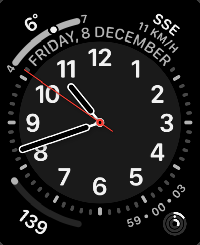
My main watch face

Yesterday though, something odd started to happen. I noticed that some things didn't seem to be syncing from my watch to the phone. Health-related things weren't turning up. A recorded workout didn't show. The control of all things audio seemed to decouple and the watch kept taking over use of my AirPods from the phone in an annoying way I'd never experienced before. Things like that.

I tried a reboot of the watch. Stuff turned up.

It happened again. I tried a reboot of the phone. Stuff turned up.

It happened again.

I then rebooted watch and phone, stuff seemed fine, and I didn't think much more about it.

Then this morning I swapped from the SE back to the Series 8 as I sat down for breakfast, my usual routine, and the syncing was failing again.

This, for me, this is when Apple stuff gets really frustrating. There's no easy or obvious way to diagnose what's going on. Like: I could not sync some health data from the watch to the phone, but I could use "Find My" to ping the watch (presumably a difference in communication route, BT vs Wi-Fi perhaps). There's no obvious error dialog. There's no obvious log to look at. There's no "your BT is borked" alert or something.

Searching online the advice seemed to be the nuclear option: unpair the watch, reset it, start again. So I've done that this morning and it's been quite the pain. Getting it set up again was straightforward enough, but having to go through the whole thing of dismissing all the "here's some tips on how to use this watch you've had for a year and used every day" cards was annoying, also having to set up my payment cards again was annoying. Also, and this is on me for not backing them up recently, trying to recreate my watch faces from memory and remembering which ones they were based on was also annoying.

Apple are actually so good at a lot of this seamless shit; but damn do I wish they'd also be good at making a tool that lets you easily and smoothly diagnose some issues. I would imagine sync issues between watch and phone are common enough that a wee tool where you run through diagnostics, and where there's a Q&A to help narrow down the issue, would be a great experience.

Anyway... it seems to be up and running again, so hopefully that's that issue solved. I tried a couple of things that would need to sync from the watch to the phone and they showed up instantly; actually faster than I've been used to for quite a while.

Fingers crossed...


  1. During a conversation about this at work the other week, I think I figured out that the only Apple product category in which I don't own an example of the hardware is displays2. :-/ 

  2. When the VisionPro comes out I'll be able to say there's two. 


Constant Siri voice loss

Posted on 2023-10-20 13:04 +0100 in Tech • Tagged with Apple, iPhone, Siri • 1 min read

This seems to have started with iOS 17, and I can't narrow down the how and the when of it happening, but over the last week or so I've found that every couple of days Siri seems to lose their voice. By this I mean the high quality voice that's used when they speak seems to disappear. I notice this when I ask my phone or headphones a question or to do something, and I get a really low-quality voice that speaks back to me.

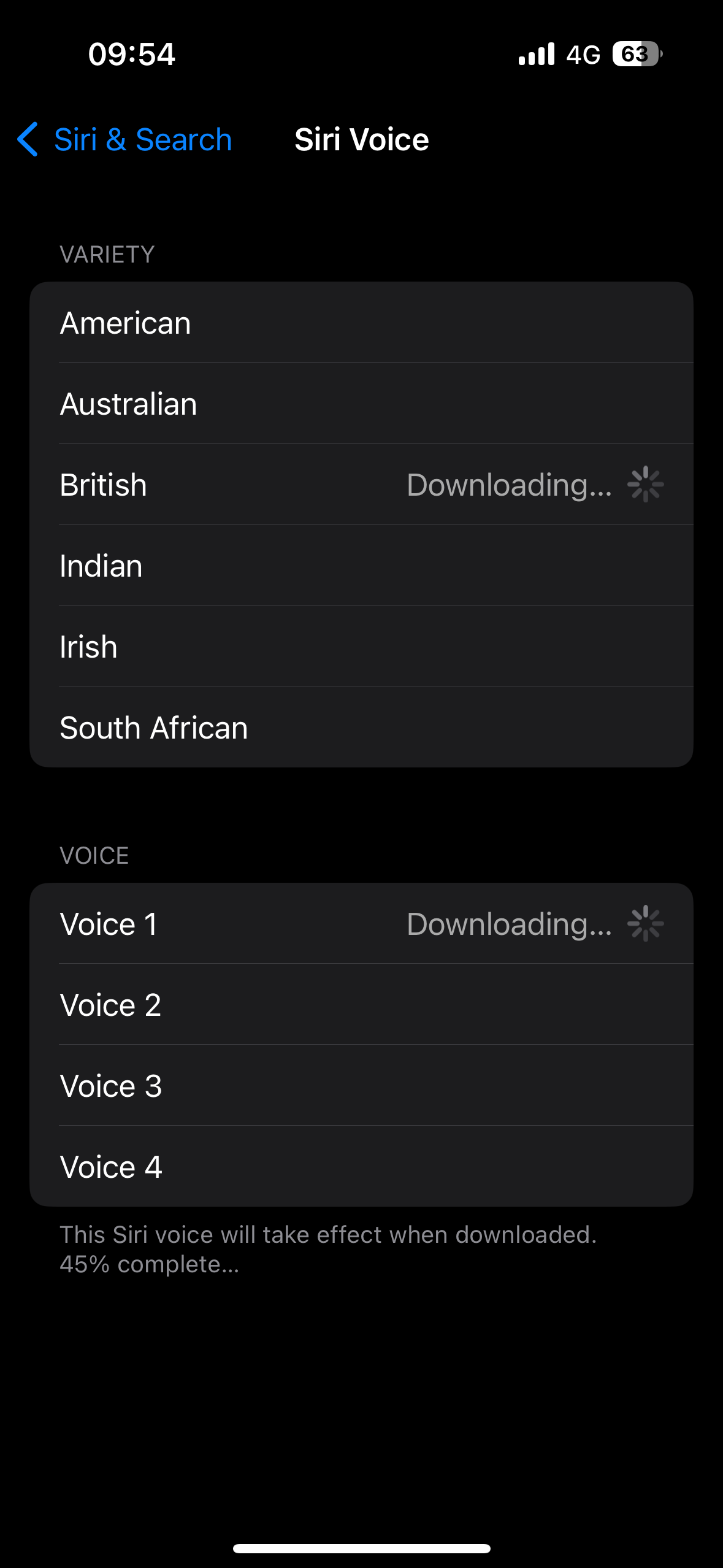
The voice itself seems to be a version of the voice I normally use, but like it's using an on-device much-cut-down version. If I go into the settings to check what voice is selected, it's the one I normally use, but it wants to download it again.

Downloading the voice all over again

Sure enough, once the download is complete all is good again. I've not kept track of when it happens -- and I think I should from now on -- but it feels like it happens every couple of days; I almost always notice it first thing in the morning, the first time I ask the phone or the headphones something.

I hope it is some sort of iOS 17 weirdness and is gone when 17.1 turns up.


LinkedIn is useless

Posted on 2023-10-16 14:16 +0100 in Tech • Tagged with LinkedIn • 2 min read

I have a LinkedIn profile more by accident than on purpose. For most of that site's early days I just ignored it, even needing to go to the trouble of aggressively marking emails from it as spam as it seemed to want to turn itself into some sort of online networking cult, encouraging folk to send invites to their contacts, or worse. But after job-seeking in late 2017 the recruiter who found me the position I took up asked if I might join up and endorse him or some such nonsense and, at the time, I thought what the hell.

Since then though I've mostly found it useless, and at times straight up horrific. Don't even get me started on how a previous employer's push to make everyone use their profiles as more company branding created a perfect pool for people to go phishing in, while at the same time IT were on a phishing-awareness push; a perfect illustration of how some people lose their minds when it comes to that site.

The last year though, while working in a more FOSSy world, I've started to dip my toe back in when it comes to linking to what we're building with Textual. As such, I drop into the app once or twice a week and look to see what other folk might be talking about too.

During a recent dip in I saw this:

A suggestion from LinkedIn

Huh! Okay! That... that's actually kind of sensible! While I'm nowhere near looking for anything else to do, showing off the public projects you care about seems like a good idea. GitHub repos can be a good CV, I believe.

So I click through...

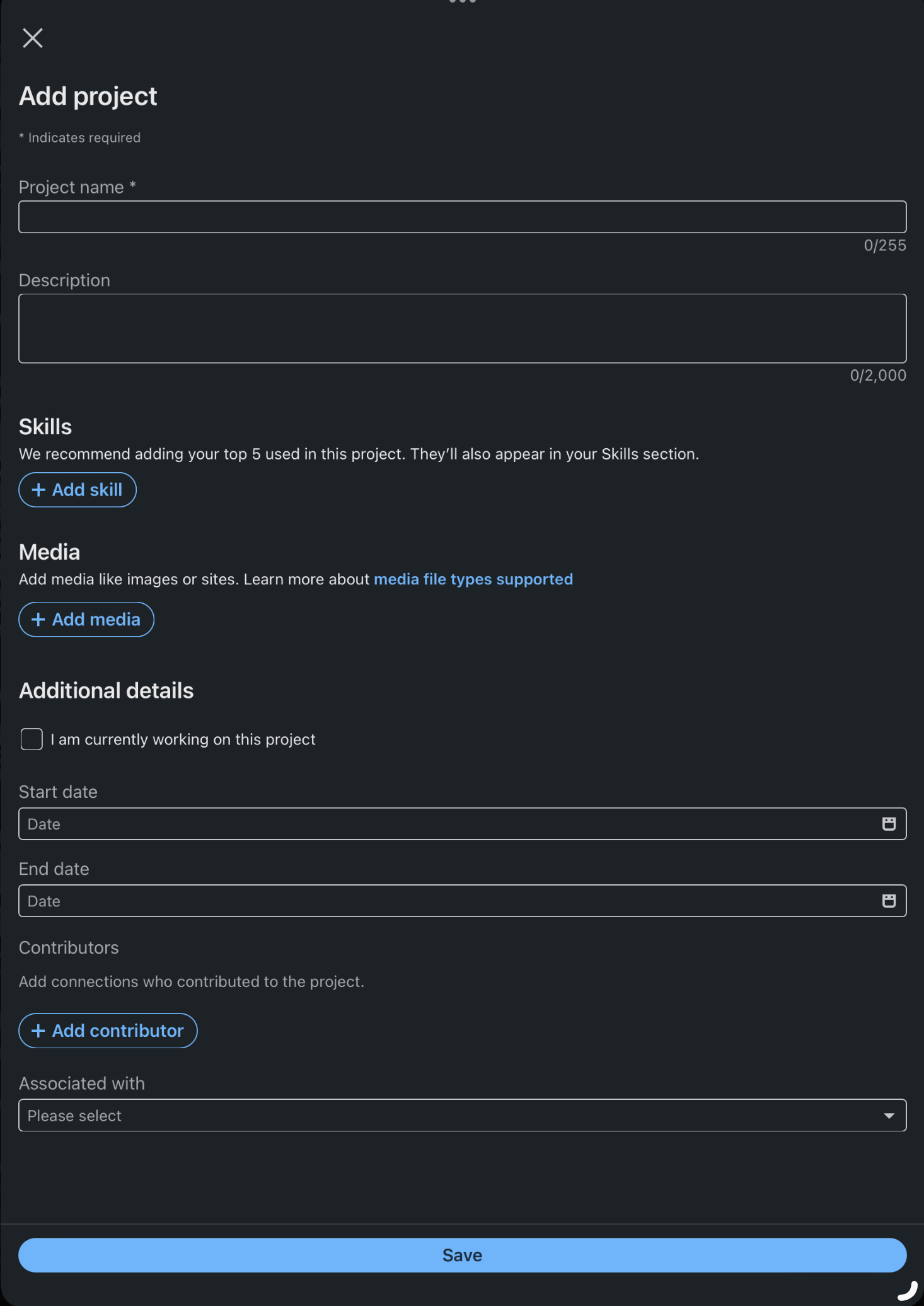
The project add form

And that's where it all falls apart. Pretty typical for LinkedIn I'd say. Name, description, obsession with skills, obsession with building up a social graph. But...

No link to the repo.

No.

Link.

To.

The.

Repo. O_o

o_O

I can't even.


Going full Apple search

Posted on 2023-10-14 08:39 +0100 in Tech • Tagged with Apple • 2 min read

For as long as I've had a smartphone -- so ever since the HTC Magic was released -- I've used whatever search tool Google have had available as my way of searching for stuff from my phone. Even when I made the switch to the iPhone, back when the iPhone 11 was around, I still installed and used the Google Search app.

Since jumping ship from Android to iPhone, I've followed the usual track that some do of "embracing the ecosystem", and it generally has paid off. The more I lean into "the Apple way", the more stuff actually does work together and work together well (I won't say "it just works", because that can sometimes so very not be true, but really I do find that Apple's ecosystem is more coherent and more stable than the one Google provided). But searching for stuff... that stuck with the Google search app.

So, more as an experiment than anything else, starting this morning I've removed the Google search app from the home screens of my iPhone and my iPad and I'm going to force myself to use Spotlight to do all my searching, and see how I get on with it.

Searching with Apple

Of course, when it comes to searching for stuff on the web, it's not going to make a whole heap of difference; it's sill going to end up searching with Google, but I do like the idea of search leaning into what Spotlight knows about my stuff too.

Also, on my phone at least, it has the added benefit of freeing up a slot in the dock at the bottom of the home screen.


Apple Design

Posted on 2023-09-23 08:10 +0100 in Tech • Tagged with Apple, iOS, iPhone, design • 2 min read

As someone who started out in the Android ecosystem when it came to smart phones -- starting out with a HTC Magic and going through a few different phones before settling on Pixels (until I finally jumped ship to iOS in 2020) -- I have to admit that there's always been something nice about the design of iPhones. iOS, less so... My first exposure to iOS was back in 2015 when I got an iPod, and I wasn't terribly impressed. It looked okay, but it felt so far behind Android in terms of functionality.

Much has changed and improved since then. These days, 3 years into being totally consumed by the Apple ecosystem (one day I should write a post about how comprehensively I've moved over), I'm won over and I like how iOS works now.

Except this...

Bad design

That thing where, when you're in one app, it will show the most useless link "back" to another app, and in doing so bump the time up and out of the way a little. Like, seriously, compare it to when the app link thing isn't there:

Good design

Once you see it, you can't unsee it.

Toggle of the two images

After all this time you'd think they would have found a less janky way of doing this; perhaps even simply removed it (I can't remember the last time I needed or wanted the ability to go "back" an app like this, especially not with the bottom-of-screen swipe gesture being a thing). If nothing else you'd think that, by now, they'd have found a way of doing it that doesn't look so terrible.

The "eh, let's just shove it here" approach that seems to be on display here almost reminds me of the "time wiggle" that used to mildly annoy me back on my iMac.


The HomePod fixed itself

Posted on 2023-08-12 07:46 +0100 in Tech • Tagged with Apple • 2 min read

A couple of weeks back I mentioned home my main HomePod had got stuck installing 16.6 of the software that runs it. This situation persisted for days after writing that post and I kept promising myself that I was going to see if I could unstick it by removing it from the Home, doing a factory reset and adding it back again.

Of course, during the week that followed, I never got round to that. You can imagine what it's like: no time in the morning, and by the time I get home in the evening I want to watch TV and use the HomePod as the speaker for the Apple TV, I don't want to be doing tech support shit.

The following weekend... yeah, I kinda forgot.

So, here I am, a couple of Saturdays on, it's early morning, I've had breakfast and I'm having coffee and I think it's the perfect time to do this. I hope the Home app my on iPad and... it's sorted!

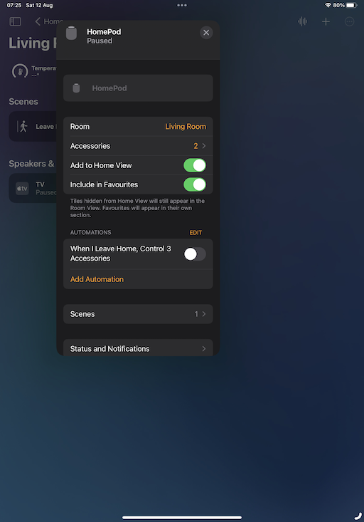
HomePod all good again

So, yeah, it looks like it somehow managed to unstick itself in the end. A quick test of some of the issues I was seeing suggested there was still an issue, for example asking for the temperature in the bedroom would still result in a "working on it" reply followed by it telling me it wasn't responding. A quick reset seems to have fixed that.

I guess it's good to know: if it happens again, it'll keep on working as the speaker for my Apple TV, and it'll eventually sort itself out even if I don't muck about with a hard reset.


I turned it off and on again

Posted on 2023-08-10 18:17 +0100 in Tech • Tagged with Obsidian, Apple, iCloud, iPhone, Mac • 1 min read

Following on from the previous entry, where I outlined a weird problem I'd started having with syncing Obsidian via iCloud, I finally decided to sit down and try and work out the exact flow of the problem. Today, for example, I'd created an entry in two different vaults on my phone while on the bus into work, and when I got to my desk the vault I use on my work machine had updated.

However, when I got home this evening, the vault for my personal stuff hadn't updated on my home Mac Mini. I tried a few edits, in both vaults, on the iPhone, and nothing came through to the Mac.

So... before I started really diving into things I decided to "turn it off and on again" -- the iPhone that is -- and when it came back I ran up Obsidian, which told me it wasn't allowed to access my iCloud drive!

I took a moment to go into the settings to try and figure it out, didn't find what I wanted right away, then got to thinking that perhaps some of the phone's services were still spinning up, so I ran Obsidian up again (after killing it).

Sure enough, this time, it saw my vaults. With both vaults open on my Mac I made edits to open entries and the edits started to flow.

So, yup, looks like it was a simple case of "turn it off and on again".

Apple: #ItJustWorks.


Strange Obsidian sync issue

Posted on 2023-08-08 20:55 +0100 in Tech • Tagged with Obsidian, Apple, iCloud, iPhone, Mac • 2 min read

Since October last year I've been getting into using Obsidian. Not that heavily, not to the extent some people do, but just as a way to keep a daily journal of work-related things. Each day at Textual HQ we finish off with a chat about how our day has gone, stuff we're wondering about, etc, etc... So I don't lose tack of what I've been up to I keep notes and Obsidian is how I do that.

One of the things I really like about it is how I can have iPhone, iPad and macOS versions on the go and have it all sync via iCloud. It generally works well.

But in the last couple of days I've noted the oddest problem, and I've yet to pin down the exact flow. But it seems to be this:

  • If I create or edit a note on my iPhone, it doesn't turn up on my Mac.
  • If I create or edit a note on my Mac, it turns up on my iPhone.

I think I might have seen variations on that theme but I've not made careful note -- normally I'm made aware of it when I'm trying to get something done.

What's super weird is this: on the iPhone, if I create a note, and then go into the Files app and look at the iCloud folders for Obsidian, the file isn't there! It's there in Obsidian itself, I can move it about, edit it, etc, etc... but it's not in the "vault" as seen from the Files app.

It's the last part that has be really puzzled.

If I get to the bottom of this I'll try and remember to write up what I find. I suspect I'm going to need some proper clear time, without other distractions, and experiment with all the edit and sync options and see what works and what fails.