Apple Design

Posted on 2023-09-23 08:10 +0100 in Tech • Tagged with Apple, iOS, iPhone, design • 2 min read

As someone who started out in the Android ecosystem when it came to smart phones -- starting out with a HTC Magic and going through a few different phones before settling on Pixels (until I finally jumped ship to iOS in 2020) -- I have to admit that there's always been something nice about the design of iPhones. iOS, less so... My first exposure to iOS was back in 2015 when I got an iPod, and I wasn't terribly impressed. It looked okay, but it felt so far behind Android in terms of functionality.

Much has changed and improved since then. These days, 3 years into being totally consumed by the Apple ecosystem (one day I should write a post about how comprehensively I've moved over), I'm won over and I like how iOS works now.

Except this...

Bad design

That thing where, when you're in one app, it will show the most useless link "back" to another app, and in doing so bump the time up and out of the way a little. Like, seriously, compare it to when the app link thing isn't there:

Good design

Once you see it, you can't unsee it.

Toggle of the two images

After all this time you'd think they would have found a less janky way of doing this; perhaps even simply removed it (I can't remember the last time I needed or wanted the ability to go "back" an app like this, especially not with the bottom-of-screen swipe gesture being a thing). If nothing else you'd think that, by now, they'd have found a way of doing it that doesn't look so terrible.

The "eh, let's just shove it here" approach that seems to be on display here almost reminds me of the "time wiggle" that used to mildly annoy me back on my iMac.


Quiche Reader

Posted on 2023-07-27 08:42 +0100 in Tech • Tagged with software, reading, recommendation, iOS, macOS, iCloud • 2 min read

I can't quite remember where I found this this week, I think it might have been via a comment on some article on the orange site1, but I stumbled on a really handy bit of free (as in beer) software called Quiche Reader.

It's really simple and I feel exactly the sort of thing I need. Over the years I've tried all sorts of "save to read later" tools and systems; be it things like Pocket, or tools now built into the browser these days, even adding URLs to Remember the Milk (back when I used that) or (these days) Apple Reminders.

Nothing ever quite stuck. Normally I'd end up slapping stuff to read into these systems and then never reading them.

Quiche Reader, so far, feels like the perfect approach.

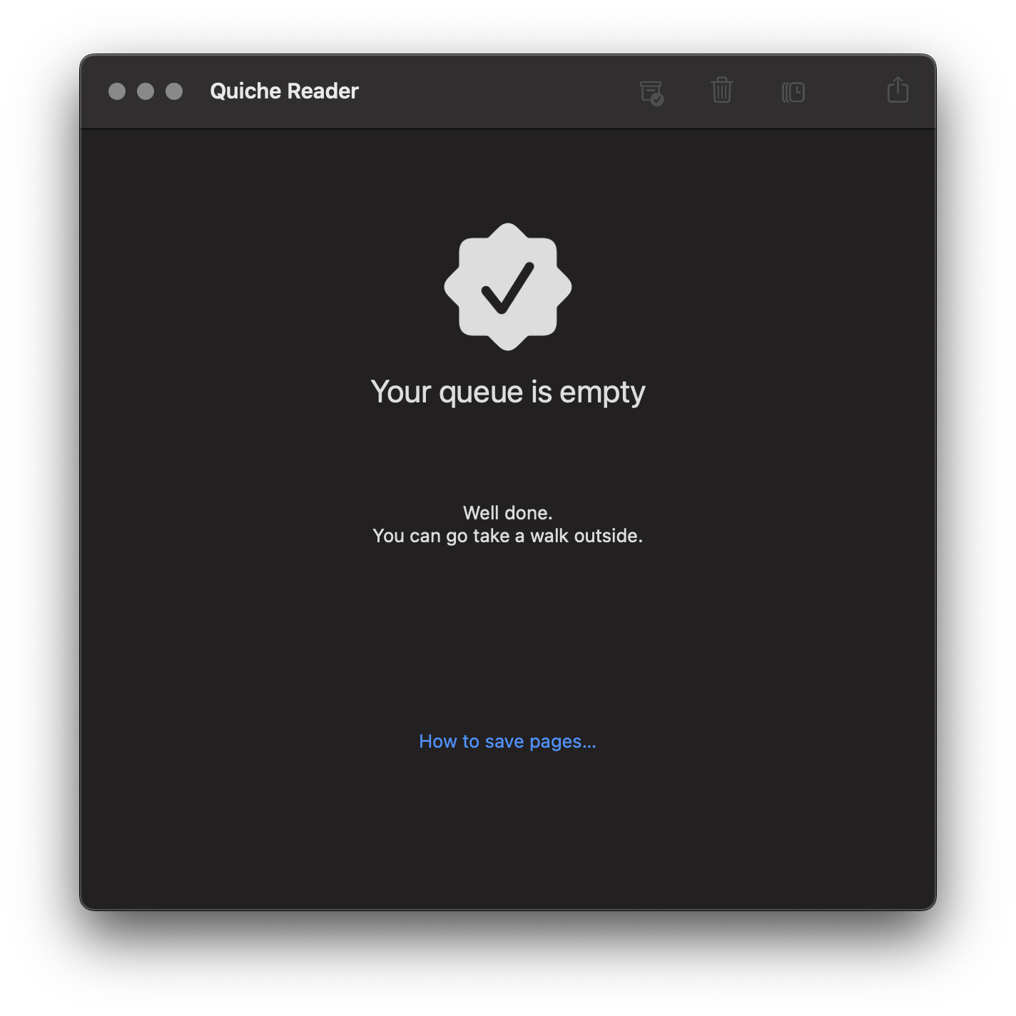
Quiche Reader in action

It's quite simple: if I see something I want to read a bit later I save it into the application (which will sync to my other devices via iCloud). Then, when I go to Quiche Reader, I have to read the article or delete it and move on. This is sort of what I'd do anyway, saving stuff up for months on end until one day I'd declare saved reading bankruptcy and then start the whole cycle again.

Now I can look at the saved article stack and I'm forced to either read the thing, or be honest with myself that if I'm not gonna read it now, I'm probably never going to.

It does have a "pause" facility (or something like that, I forget the name) where you can throw an article to the back of the queue; but even then that means it'll keep popping back to the top again.

I'll see how it goes; but so far I feel like this is the best "I'll save this to read later" tool I've found yet.


  1. I know, I KNOW! But there's so few places left to aimlessly scroll on the bus now! 


Medium login on Android and iOS

Posted on 2015-06-25 15:39 +0100 in Tech • Tagged with iOS, Android, Medium • 2 min read

I woke up this morning to find that one of my more recent favourite websites, Medium, had finally released an Android application. I'm more of an avid reader than a writer on there (I've only ever written 2 articles on there, and have toyed with the import facility too) so I imagine the app won't make too much of a difference to me, but it was nice to see that something that had been iOS-only was now on Android too.

I installed it on my Nexus 7 and Nexus 6 and then, given that I have an iOS device now, I installed it on that too. In doing so I noticed a very curious difference:

Medium login on Android

vs:

Medium login on iOS

Notice how Android has Google as an option whereas that's not an option on iOS? The curious thing is, when I installed it on my Android devices, I logged in with my Google account and it all just worked. I was into my account, there were the sorts of stories I'd be interested in, and there were the couple of stories I'd written.

On iOS I logged in with my Twitter account and the same thing happened (I don't use and don't have an account on Facebook).

It was than that I had to think about how I even logged into Medium normally (via the web, which is what I'd always used up until now). Seems I'd always used the Twitter login (which would make sense).

So here's the thing that's got me wondering now: when I logged in with my Google account, how did it make the connection to my Twitter account? I mean, sure, there's got to be enough data kicking around to actually make the connection and it seems like a safe enough one to make but... huh? I must be missing something here though, it's as unexpected as it is handy.

It's also worth noting that if you go to log in to the website Google accounts are not an option (there is a sub-option for "Android Users" where you have to create an account based off your email address, from what I can see).

I'm left trying to decide if I missed a step here, if this is clever, or if this is just plain creepy (and who's responsible for having made the connection).

Edit to add: Cara from Medium was kind enough to notice my tweet pointing to this post and let me know the how and why of the above. Turns out it's what Rich suggested in the comments.


And now for some iOS

Posted on 2015-06-23 23:09 +0100 in Tech • Tagged with Mac, Apple, iOS, iPod • 3 min read

I'm on a bit of a "explore other universes" trip at the moment, it would seem. The other weekend I finally cracked and purchased my first ever OS X device and, earlier today, I purchased my first ever iOS device.

Don't worry, I'm not abandoning the world of Android; far from it if my experiences of iOS so far are anything to go by. However, having started slowly working through a book that teaches Cocoa and Swift I thought it might be interesting to be in a position, at some point in the future, to be able to make and throw an app at an iOS device and it seemed the most affordable way of doing that was to grab an iPod.

So I did.
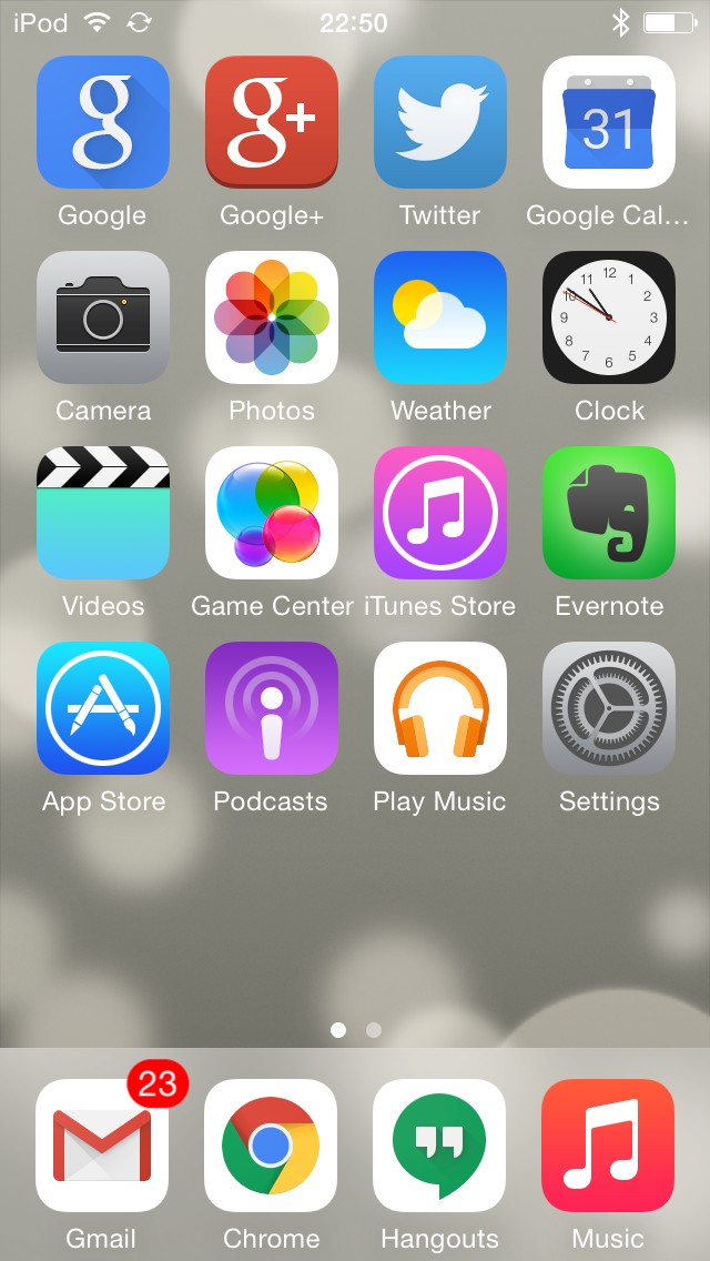
I now own an iPod

One of the first things I did, and I'm glad to find it was possible, was to load it up with apps that make it into a reasonable Google device (so, so far, I've got Gmail, Google+, Google Calendar and Google Music on there -- need to sort Google Drive too, at least). Next up was to get some music on it too -- might as well actually use it to listen to music, I guess.

That actually turned out to be more fun than I was expecting. See, I gave up on iTunes many years ago, back when it was pretty much the only legit method of buying music online. Since then I've tended to work with ripped copies of my CD collection or I've listened to music I've bought on Google Play (the latter bulked out with the former thanks to Google's music uploader).

And here's the fun part: if you use the recent Google Music Chrome app (which, it seems, allows unlimited downloads of your albums) to pull the music down, and drop them into iTune's import folder, magic happens and iTunes gets nearly populated with music. Even better, music that I'd originally ripped as WMAs comes back own as mp3s, so solving the problem of iTunes not doing WMAs.

Handy!

So, anyway, that's the iPod set up as a generally useful device.

As for iOS itself.... Ugh. I'm far from impressed. Compared to Android it feels old and clunky and very constraining. For example, I can't really control what's on the home page. Sure, I can move things about, and I can even remove apps I've installed, but I can't remove/hide Apple's own apps at all. The best I've managed to do is drop all of them in a folder together and ignore that folder.

I'm finding the whole navigation thing kind of frustrating too. The lack of a standard back button -- as you have on Android -- means that different apps seem to do different things in terms of allowing back navigation. I'm also still unsure how you can easily task switch (if there is a way of doing that it's not obvious to me).

Another thing that's frustrating me is "AirDrop". I tried to use it to get the screenshot you see above onto my iMac but nothing I did would make it work. The iPod would see the iMac and the iMac would see the iPod but the filed didn't appear to want to move at all.

Yet another thing that seems rather unstable is the whole business of WiFi sync. That seems like a sensible idea -- let iTunes on the Mac know that the iPod lives on the same network and have them sync that way. Problem is that I'm finding that it drop out during a sync more often than not. The only reliable method of doing a sync that I've found is to use the USB cable.

I've yet to write the blog post about my experiences with the Mac so far but what I'm finding here fits in with what I've found with the Mac: some of the ideas are really rather clever but they just don't quite work as well as people would seem to want to have you believe. Apple gear has this reputation of "just working" and I'm finding that this really doesn't seem to be the case at all.

Still, it's all a learning process and I know far more about Apple gear now than I did a week or so back, and I'm learning more as I go.