My history with computers starts with a Sinclair ZX81 in the early 1980s,
followed shortly by a Vic20, then on to the BBC B and fairly quickly on to
very early IBM PC compatible machines. In the early 1990s I added OS/2 (during
the introduction of Warp) and not too long after that GNU/Linux. Along the way
I've also used the odd Unix here and there as well as CP/M, RSTS and VMS.
Aside from an inherited Mac whose model name escapes me, and whose operating
system version also escapes me, I've never really had too much exposure to
the world of Apple.
A couple of weeks back all of that changed.
It's quite a long time since I had a Unix of some form as a desktop machine
and I was starting to get the urge to have one again. During all of this time
I've had a GNU/Linux box or two available but for the past few years I've
always used them from the (dis)comfort of my Windows desktop. Generally that
was fine because the uses I had were not desktop.
Anyway, long story short: I started out thinking that I wanted some form of
Unix on my desk again and, somehow, ended up walking out of a shop with
an iMac.
Given the above history I thought it might be fun to jot down my experiences
in the first couple of weeks. This will be a vaguely random wander through my
experiences. It's not a review. It's not even really intended as a judgement
of the machine and the operating system. It's nothing more than a collection
of notes of what I found and my reaction to what I found.
The keyboard
The first strong reaction I had to the machine was regarding the keyboard. I
thought I was going to hate it. I've had the misfortune of using various
chiclet keyboards over the years and I've hated every single one. I find that I
can't type on them, that it doesn't feel right, and that it makes my fingers
ache badly if I spend too much time using them. My history and experiences
has always been such that I've generally preferred very mechanical-feeling
keyboards.
This just wasn't the case with the iMac keyboard. I don't know why, I still
don't know why, but this feels like one of the most comfortable keyboards
I've ever typed on. Despite the keys being chiclet style they move in a very
positive way that really surprised me. It doesn't hurt to type, at all, and
I'm finding I can type faster on this keyboard than any other I've typed on
before.
There is a flipside though. I find the whole design far too cramped. Even now,
a couple of weeks later, as I type this on it, I wish the keys were just a little
bigger and just a little more spaced out. I'm adjusting, of course -- much of
this is about muscle memory -- but it does mean that it's in a constant fight
with my "knowledge" of my other main keyboards.
And then there's the keys that it lacks.
I'm still finding that this is a terrible keyboard for a programmer. For one
thing, here on the UK version of the keyboard, there's no # key. At least,
there's no simple, comfortable, direct access to the # key. Any time I want
to type a # I have to shift my left hand to find the (I think it's called
the) option key and hit 3. Shift 3 is £. And it gets even worse. This setup
doesn't work at all in GNU emacs so I then have to put the keyboard in
Australian mode so I can use shift-3 to get a #.
Why there isn't a proper # key is beyond me.
And then there's the (on the version that came with this iMac) complete lack
of page keys as well as home and end. Overall this makes the whole keyboard
feel very unfriendly to programmers and also to writers in general.
This, of course, is my bias and muscle memory from PCs showing. I'm still not
convinced that that bias and muscle memory is wrong.
The mouse
When I first started with it I hated the mouse. I should be fair and point out
that, overall, I hate mice anyway. For a good 20 years I've thrown away every
mouse I've ever had turn up with a machine and have made use of a trackball
instead. I find that a trackball gives me far more control and is far more
comfortable. So, initially, I put the Apple mouse to one side and plugged
in a trackball instead.
For reasons I forget now I found myself needed to use the Apple mouse again.
Once I did that I decided to "force" myself to give it a fair shot and, now,
I'm glad I did. Much like with the keyboard, despite me having a bias against
what it is, this has turned out to be one of the most comfortable mice I've
ever used. It sits right in the hand, the lack of actual buttons means I don't
have to shape my hand to fit the design but, instead, the design allows for
how my hand rests. I also rather like the gestures too.
This is the first mouse that has stayed on my desktop. I'm surprised.
By the way, whoever thought that the "natural" scroll option, which is on by
default, was "natural", is barking mad.
The GUI
One of the main intended uses for this machine is the Unix shell, working
inside the terminal. Given that the actual UI of the OS doesn't matter so
much to me. That said, I'm finding it pretty pleasant. I find it a lot
tidier-looking than Windows, although I also find it more frustrating in
some places.
One good example is in the Finder, when I have a folder open. I find that it's
quite common for me, on Windows, when I have an Explorer window open, to want
to copy the path of the folder for use elsewhere. That's very easy to do
because the path is in an edit field at the top of the window and can be
edited and copied. If there's a way to do this with the OS X Finder I've
yet to figure that one one.
Another thing I'm still not getting used to, and I'm still very unconvinced by,
as a design decision, is the business of having an application's menus always
appear at the top of the screen disconnected from the application windows
themselves. I appreciate that this is a very Apple/Mac way of doing things
but I really can't get used to the idea -- especially given that it gives
the (incorrect) impression that the whole GUI is really single tasking.
On the whole though most of this doesn't matter too much to me. Large parts
of what I'm doing is in the terminal window, with other parts of it being
in my editors of choice (either SublimeText or GNU emacs, depending on what
I'm doing) or inside Google Chrome. In other words the general experience is
one that carries over most of the main operating systems I've used on
desktop machines.
Installing software
For an operating system that prides itself on being simple to use and easy
to understand, and especially one whose bigger fans sell as being simple to
use and easy to understand (especially in relation to Windows), the whole
business of installing software seems very confusing and very scrappy.
So far I've found a few different ways of installing software and none of it
makes a whole lot of sense to me without going and searching about it and
reading up on it. Sometimes I download an app and all I need to do is drag
it into the Applications folder. Other times I get a zip which I have to open
and then... it can go a couple of different ways. Sometimes I get a 'dmg' and
when I open that up I get a window where I have to drag one icon onto another
icon in that window to do the install. Sometimes I get something like the last
one I mention but instead I have to double-click on an icon that's in the
window.
There might even be other options I've had to follow. I forget now.
And then there's the business of removing software! That seems to be complete
chaos. In some cases you delete the app and it's all good. In other cases
you need to do that and hunt down some other bits and remove them too. In
other cases it seems like the author has supplied their own uninstaller.
We've been here before. I know this setup rather well. This is exactly the
sort of world we lived in back when Windows 3.1 was a new thing. This came as
and still is a massive surprise to me: OS X is as sophisticated as a fancy
shell that ran on top of MS DOS when it comes to software management.
Doing the right thing, except when not
While I'm on the subject of the famous great design of the Mac... what's up
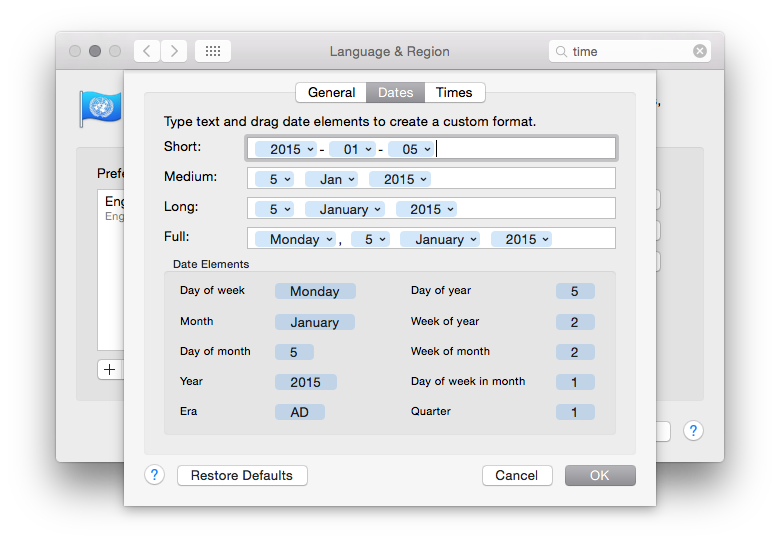
with the business of seeing the time format? The system preferences seem
very flexible when it comes to setting date and time formats. I really like
the dialog that provides this:

As you might see above, my preference when it comes to date formats is to have
everything in ISO 8601 format.
Having set that I then noticed that the time shown in the menu bar on the
desktop was.... whatever the hell Apple appear to have decided for me!

Even Windows lets me set the date format as I want it in the desktop time
display. Apple, meanwhile, seem to provide a great method of letting you
set your date and time formats "just so" and then they seem to just go right
ahead and ignore your preference in the one place you'll see it the most.
If you have a Mac, you have software I wrote on it (I think)
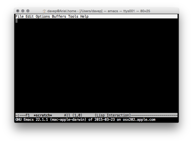
From what I could tell every Mac has a copy of GNU emacs installed, out of the
box. That actually kind of impressed me. Sure, it's a rather out of date
version of GNU emacs, but it's a copy of GNU emacs and that's all that matters.

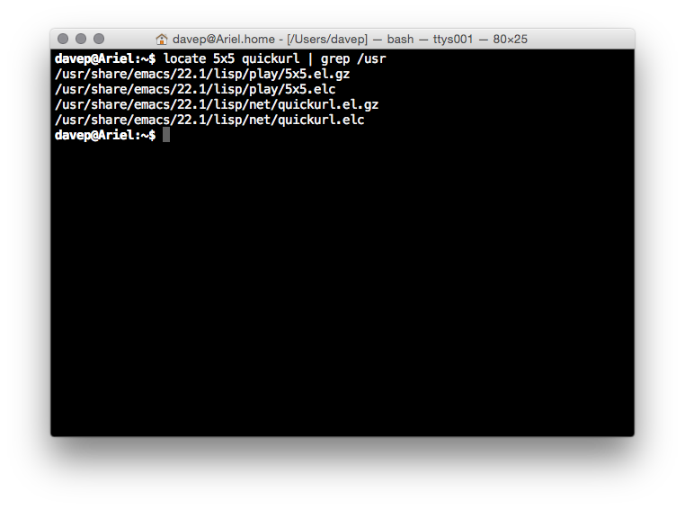
That fact actually means something rather interesting, to me. See, there's
two small packages that are part of GNU emacs that I originally wrote. One is
called 5x5, the other quickurl.

So, yeah, from what I can see, on every new Mac you'll find two bodies of
code that I originally wrote, pre-installed.
Yeah, I know, shitty claim to fame. I'll take it anyway. ;)
Overall initial impression
Overall my initial impression is a good one. The Apple iMac seems to make for
a pretty good Unix workstation. The keyboard layout could do with some work
to make it more friendly to programmers (well, to this programmer) but
overall it all makes sense and is easy to navigate.
If most of what you do is actually online then I'd say that an iMac would be
a huge waste of money. If you want a desktop machine for web browsing and
generally working "in the cloud" then you'd do a lot better to buy a Chromebase
(or, of course, a Chromebook if you're looking at Macbooks). On top of this,
if most of what you're doing is online but you want to do some client-side
stuff such as image/video editing and gaming then I struggle to see how an iMac
would be a good choice too. For the money it's hilariously underpowered
when compared to a reasonably equivalent Windows PC (or, of course, GNU/Linux
machine if what you want to do can be done there).
My own reasons for purchase were about having a desktop Unix workstation that
I could install various compilers on so I could muck about and work on some
fun projects I want to get done. It was an unusual extravagance that I don't
regret and, so far, I've been pleased with.
There's very few people I'd actually recommend one to though as it seems
pretty clear to me that, generally, their money could buy them so much more.
But it's a nice new shiny toy. ;)
