Change of watch face

Posted on 2015-10-07 14:57 +0100 in Tech • Tagged with Android Wear, Moto360 • 2 min read

I'll be the first to admit that I'm a creature of habit. Once I get used to something I find it hard to change. In many areas of my life there has to be really compelling reasons to change something. I've found that this is the case with my Android Wear watch.

When I first got it it took me a couple or so days to find a face that I was happy with and, in the end, I went with Pujie Black, along with a colour scheme I set up myself (called RGB, for obvious reasons).
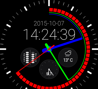
Pujie Black with RGB face

Today though I stumbled on Krona Sunlight. This face really got my interest. Part of the reason is that, while what I'm wearing is normally called a "watch", I don't see it as a watch (just like my phone isn't really a phone). It's a wearable Android device that gives me handy info at a glance and lets me set reminders and things without even having to reach for my phone, tablet, Chromebook or desktop machine.

This face fits perfectly into that.
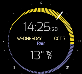
Krona Sunlight face

While it lacks the battery information (edit to add: it doesn't lack battery information, it's just an option that is off by default), and second time display, that Pujie Black has, it more than makes up for it with the rather fantastic display of weather and sunrise/set information -- especially how it displays temperature.

This was enough to not only have me buy a copy, but also to switch to it. I'm going to be sticking with it for the next couple of days to see how I feel about it and see if I miss any of the other information.

This might be a little bit of change I can cope with.


iMac Time Wiggle

Posted on 2015-10-07 11:38 +0100 in Tech • Tagged with iMac, Apple, OS X • 1 min read

Apparently that famous Apple obsession with design doesn't apply to the time display on the OS X login screen (the wake-from-sleep password confirmation one anyway):

Time wiggle

I've never noticed it before. I'm not sure if this came about with the upgrade to El Capitan or not. But now I've seen it I can't unsee it.


El Capitan

Posted on 2015-10-06 13:53 +0100 in Tech • Tagged with Mac, Apple, iMac, OS X • 2 min read

Almost a week ago (yes, I have being meaning to write something down about this and have kept failing to do so) my iMac told me that there was a new version of the OS waiting for me. While this is doubtless no big deal for most Mac owners, this was interesting to me because it's the first time I've experienced an OSX upgrade since I got the iMac.

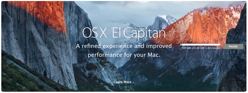
El Capitan downloading

The download took a while and, while the install had a couple of curious bumps along the way, nothing seemed to actually go wrong.

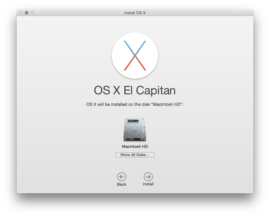
About to get going

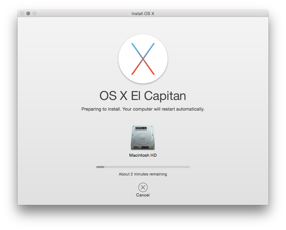
The two main things I noticed were that it seemed to take the installer an absolute age to close down all running apps before it got to doing the installation. The other was that Mac progress bars seem to have a very odd way of calculating things. Often it would tell me that there was (for example) 28 minutes to go, it'd stay like that for 20 minutes, then drop 5 minutes, then appear to finish very soon after.

The final countdown

Mostly though I just left it alone and let it do its own thing. While the whole process took quite a while, it came back just fine (if I'm fair I'm not sure it took much more time than when I upgraded my laptop from Windows 8.1 to Windows 10).

The changes and improvements aren't really that obvious. I think I would say that the machine feels a little quicker in places, but nothing I can really put my finger on. One of the things I do like is the new split-screen facility for full-screen apps. While I don't use the full-screen facility that much I have found the need to split the screen before.

Some of the other improvements I've read about seem to involve things I'm never going to use: either improvements to Safari (Chrome all the way for me), the Mac Mail app (Gmail all the way for me, with Kiwi for Gmail being my client of choice on the iMac) or various iOS-oriented things which are of little use (while I do own an iOS device it's not one I use much).

Overall the thing I'm taking away from this is that the upgrade was smooth, nothing was obviously broken or changed in a way that was confusing (unlike some Windows or ChromeOS updates I've experienced in the past) and I didn't have to do anything that required much in the way of knowledge to keep it all going.

Doubtless that won't always be the case, such is the nature of OS upgrades.


My iMac thinks I'm in Spain

Posted on 2015-09-10 14:44 +0100 in Tech • Tagged with Mac, Apple, iMac • 1 min read

While on the phone earlier I was doing that thing you often do when chatting with someone where you don't have to concentrate on something in front of you: I was randomly clicking around stuff on a machine. In this case I was faffing around on my iMac.

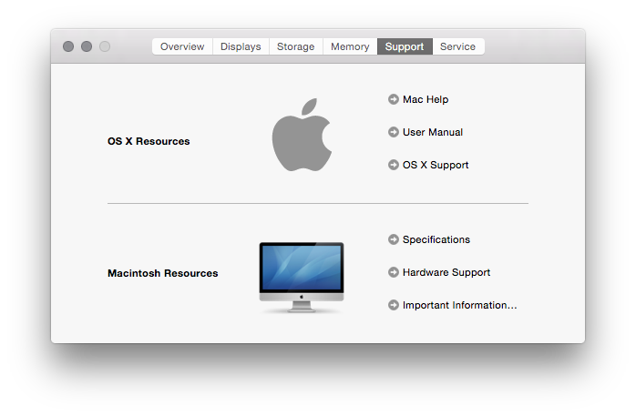
One of the places I landed was in the About dialog, looking at the support details:

Support details of the iMac

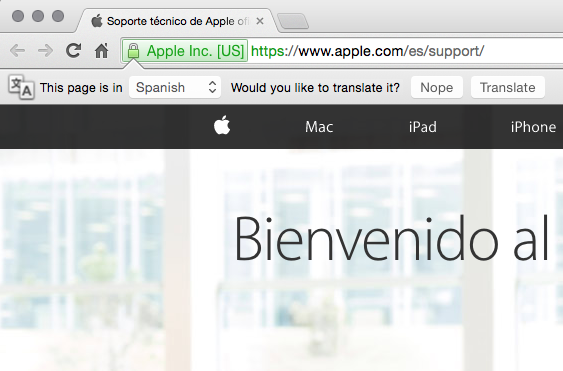
Out if idle curiosity I clicked the "OS X Support" link, which opened my browser and took me to Apple's website. Only.... it didn't take me to a part of the site that was that useful to me:

Seems I read Spanish

Yes, for reasons best known to Apple or my iMac, I apparently need my help to be in Spanish. O_o

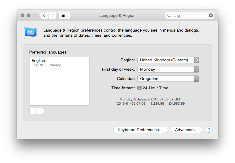
I could understand this if I had my system set to Spanish, which I don't:

Seems I read Spanish

About the only "non-standard" thing I have in my setup is the date, which I've set to ISO 8601 style rather than the usual UK style. I even experimented with changing that to the default on the remote chance that it was tickling some sort of odd bug in OS X.

So, yes, another wonderful example of Apple stuff "just working" and being good for mortals. Well, for interesting values of "working" anyway.


Unknown promo

Posted on 2015-09-04 08:53 +0100 in Tech • Tagged with Google, Google Drive • 1 min read

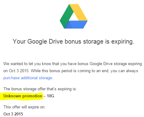
Ahh, Google, knower of all things that can be known about me, tracker of all things that can be tracked about me, controller of my phone and even my watch, able to use Now to suggest stuff I need to know even before I need to know it.

Tell me again what promo that 10GB was from...

Unknown Promo


Full Apple keyboard on Windows machine

Posted on 2015-08-17 11:31 +0100 in Tech • Tagged with Apple, keyboard, Windows • 3 min read

I seem to have somehow messed up my left hand. I'm not sure what the problem is yet, I'm speaking to the doctor and have had an x-ray to check out one possible cause, but the simple fact is that my left hand has an issue. Sometimes the arm is painful, pretty much all the time a couple of fingers are near-numb. One unfortunate side-effect of this is that I'm finding typing rather uncomfortable. Except, that is, when I'm typing in my iMac.

Given that the vast majority of the typing I do is on my Windows 7 desktop machine I decided it was time to look at getting a new keyboard, one that was as comfortable to type on as the Apple keyboard. Given that I really needed to be in a position where I could actually try the keyboards out I headed off to the local PC World.

Long story short: none of the Windows-oriented keyboards I tried did it for me. None were as comfortable as the Mac keyboard. I tried a few a couple of times and then suddenly had an idea... Apple do a full-size keyboard and, from what I've seen in the past, it does work with Windows, after a fashion. So I went to talk to the Apple guy, checked they had one in stock, handed over £40 and headed home again.

Apple Keyboard

Having now worked with it for a couple of days I think this might be one of the best keyboard purchases I've ever made.

It's not ideal, of course. The keyboard isn't designed to work with Windows, it's designed for the Mac. But for the most part I'm finding that it's not confusing and I'm adapting just fine.

I had to go searching for an unofficial layout that I could install (one that's actually old enough that it doesn't even say it supports Windows 7) and installing that seems to have cured a few issues. The issues I do have remaining are:

  • Depending on the application I'm in, @ and " are swapped. Really, I'm not kidding. In SublimeText @ and " are the right way round; in Skype they're the wrong way round. I suspect that this might be down to the fact that I need to restart applications so they take up the new mapping (a reboot of the machine might be in order here).
  • The keyboard has no marked insert toggle key. There is one, it's the 0 on the numeric keyboard if you have (also missing, but with a mapping) numlock turned off.
  • Alt and Win are the wrong way round. The Cmd key acts as the Win key and it is in the same position as Alt is normally in. I'm actually adapting to this pretty quickly.
  • Apple hates the # key. Much like I have problems typing # on the iMac, the same issue exists when typing on Windows too. Whereas on the iMac I have to use Alt-3 to get a #, on the Windows machine I have to use Ctrl-Alt-3. Not ideal but it works.

They're the main issues I've discovered so far. It's possible that there are other niggles waiting for me but, hopefully, there's workarounds for them too. Mostly though I'm finding that the small adjustments I have to make to how I work are worth it given just how comfortable this keyboard is to type on.

I really do wish there was a Windows-oriented keyboard that had the exact same build quality.


Bloody Facebook

Posted on 2015-08-13 09:15 +0100 in Tech • Tagged with Facebook • 2 min read

I've never really liked Facebook. I forget exactly when I ended up on there -- perhaps 2009 or so -- but I can remember exactly who to blame. It was all the fault of Rich Daley. On an atheism-oriented BB that has long since fallen off the net he convinced me that it was "X for adults" (where X was a popular early social network whose name totally escapes me now) and I fell for it.

And I hated it.

But I stuck with it.

I stuck with it until September 2011. I realised that after a few years of using it I still found the site confusing, ugly, unfriendly (in terms of design) and somewhat invasive too. On top of that I'd made the common mistake of allowing anyone I'd ever run unto on the net add me there and so the contact list was huge and out of control -- I didn't really know who most of the people were. So I deleted the account.

Back then there was, as I recall, no explicit delete option, or to do the delete thing you had to deactive and wait 14 days, or some such thing. I know that I followed the advice in the docs and did whatever was required to have my account totally deleted.

This week, at the urging of friends, I finally decided to create an account again. I initially tried to create the account using the old email address (well, actually, a variation on it that would appear to be the same to systems that understand the significance of a + in an email address) but it told me that the address was in use. Which was a worry.

So I created the account using a different address (my actual "main" address this time, as opposed to my Google address) and set about setting it up.

So I'm on Facebook again

In doing so I tried to tell it that I wanted to associate my old address with this new account and, again, it refused, telling me there was an active account for that address.

I then went and checked and, sure enough, there was my old account, still there, all the data, nothing had changed!

Fucking Facebook!

These days, however, it does look like there are very clear instructions on how to actually fully delete an account, so I've tried again for the old account. It's another 14 days of deactivation but with an actual promise that, yes, this time, they'll delete all my shit.

They better.

Meanwhile... I have a shiny new Facebook account. And I still find it confusing, ugly, unfriendly (in terms of design) and somewhat invasive.


Best update ever

Posted on 2015-08-03 12:46 +0100 in Tech • Tagged with Adobe, iMac, OS X, Creative Cloud • 1 min read

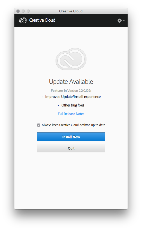
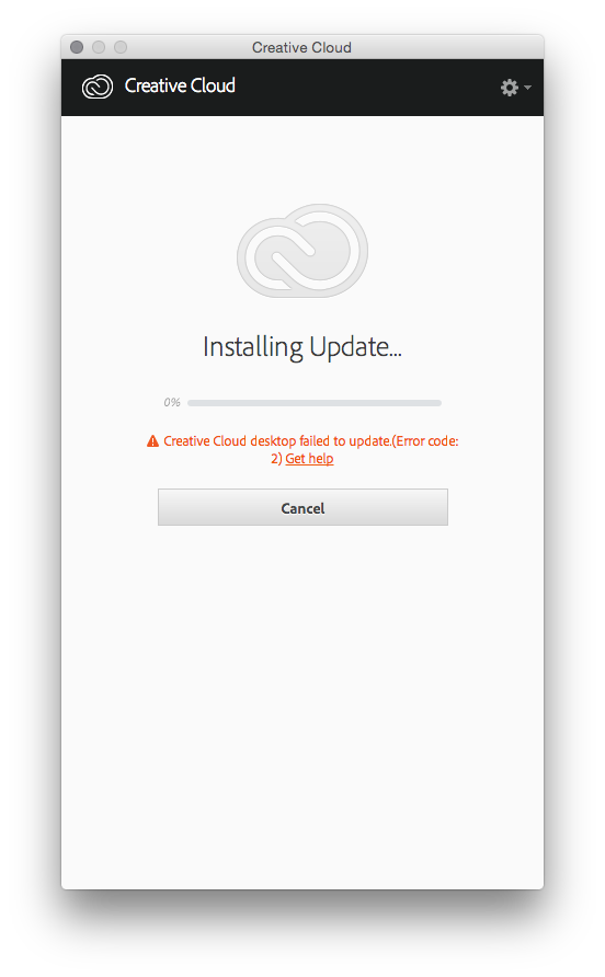
Oh goodie! An update for Adobe Creative Cloud on the iMac!

Got an update

Oh! Improved update experience too! I really must install this then...

Got an update

Well fuck.


Evernote discovers pop-up advertising

Posted on 2015-07-09 16:47 +0100 in Tech • Tagged with Evernote • 2 min read

By the looks of things, with the recent updates to their desktop applications, Evernote have discovered the joys of pop-ups for advertising purposes. I'm finding it just as annoying as it was back in the days when people thought it was the smart way to make you buy things on the web.

Yay! Pop-up advertising!

Now, to be fair, the pop-up you see above is the one on my iMac and that at least has the good taste to only pop up within the application itself (although the Evernote icon in the dock at the bottom of the screen kept jumping around like it really wanted attention when this happened). The Windows one, however, is much worse.

I've actually not had a chance to capture a copy yet as it normally has the habit of getting in the way while I'm actually trying to do something; but the Windows version has the bad taste to actually pop up over my desktop. Yes, that's right, over my bloody desktop!

In both cases it's advertising Evernote's paid-for tiers in a way that it never has before. It's seriously annoying.

Now, before anyone pipes up that it's a company that needs money to keep things going... I know. I don't mind that. I don't mind the odd nag here and there. More to the point I actually don't mind paying for software and services. I actually do pay for software and services. There's a handful of different tools and the like that I make good use of every month which I pay for because they're worth paying for.

Evernote is one that I've been considering paying for too. The problem is, what they offer in the paid versions isn't really anything I need. Everything I use Evernote for can be done in the free version; I have no need to pay for it.

There is, of course, a good argument to be made in favour of the idea that if you benefit from a service you should pay for it anyway so that it doesn't go away. Having watched the likes of Catch and Springpad disappear I think that's a very compelling argument and one that has had me, in recent months, thinking I should buy some paid-for Evernote tier.

The problem I face now though is this: this move by Evernote to go with a pop-up nagware model, especially one that's willing to pop up nagging windows on my desktop, gives me the feeling that the company is struggling and getting desperate. While this should have me thinking that now is a really good time to pay for something I appreciate it's actually having the opposite effect. It's having me wonder if, in fact, I should be looking for an alternative that isn't giving this impression.

Yes, even one that I'd need to pay for.


Odd iPod update

Posted on 2015-07-01 20:31 +0100 in Tech • Tagged with Apple, Mac, iMac, iTunes, iPod, OS X • 2 min read

Last night, before heading for bed, I noticed that there was an update available for OS X on the iMac, and also for iTunes. Despite the late hour I decided to do the update anyway. OS X updated pretty smoothly (albeit with some rather unhelpful progress bars that appear to give estimated times that have no relation to reality), as did iTunes.

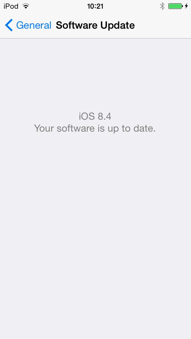
I was then told that there was an update for my iPod as well (all part of this new thing where Apple have invented Spotify, obviously). I let that start doing its thing and that's where things got odd. First it started the update and the iPod appeared to insist that it wasn't plugged into the iMac, even though it was. Then I gave it a second go (after unplugging it and plugging it in again) and it all seemed to go through just fine, only...

When is 8.4 not 8.4, iPod?

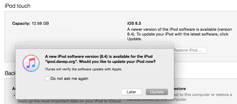
...while the iPod was pretty sure it was now running iOS 8.4, iTunes on the iMac had other ideas:

When is 8.4 not 8.4, iTunes?

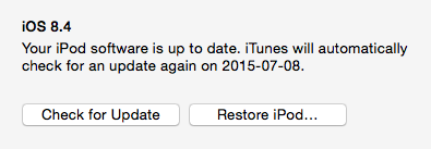
The following morning iTunes kept insisting that it needed to do the update so, even though the iPod was obviously up to date, I let it do it anyway. After it'd gone through the update process again it still insisted that the iPod was running 8.3 rather than 8.4. Until, that is, I unplgged it and plugged it back in again.

When is 8.4 not 8.4, iTunes?

So now it all seems fine. I just had to do a variation on "have you tried turning it off and on again?"

Once again I find myself running into things on a Mac that are very common elsewhere, on other operating systems, and which Mac owners would often have you believe weren't an issue.