My first couple of weeks with an iMac

Posted on 2015-06-27 18:41 +0100 in Tech • Tagged with Mac, Apple, iMac, Unix, Emacs • 9 min read

My history with computers starts with a Sinclair ZX81 in the early 1980s, followed shortly by a Vic20, then on to the BBC B and fairly quickly on to very early IBM PC compatible machines. In the early 1990s I added OS/2 (during the introduction of Warp) and not too long after that GNU/Linux. Along the way I've also used the odd Unix here and there as well as CP/M, RSTS and VMS.

Aside from an inherited Mac whose model name escapes me, and whose operating system version also escapes me, I've never really had too much exposure to the world of Apple.

A couple of weeks back all of that changed.

It's quite a long time since I had a Unix of some form as a desktop machine and I was starting to get the urge to have one again. During all of this time I've had a GNU/Linux box or two available but for the past few years I've always used them from the (dis)comfort of my Windows desktop. Generally that was fine because the uses I had were not desktop.

Anyway, long story short: I started out thinking that I wanted some form of Unix on my desk again and, somehow, ended up walking out of a shop with an iMac.

Given the above history I thought it might be fun to jot down my experiences in the first couple of weeks. This will be a vaguely random wander through my experiences. It's not a review. It's not even really intended as a judgement of the machine and the operating system. It's nothing more than a collection of notes of what I found and my reaction to what I found.

The keyboard

The first strong reaction I had to the machine was regarding the keyboard. I thought I was going to hate it. I've had the misfortune of using various chiclet keyboards over the years and I've hated every single one. I find that I can't type on them, that it doesn't feel right, and that it makes my fingers ache badly if I spend too much time using them. My history and experiences has always been such that I've generally preferred very mechanical-feeling keyboards.

This just wasn't the case with the iMac keyboard. I don't know why, I still don't know why, but this feels like one of the most comfortable keyboards I've ever typed on. Despite the keys being chiclet style they move in a very positive way that really surprised me. It doesn't hurt to type, at all, and I'm finding I can type faster on this keyboard than any other I've typed on before.

There is a flipside though. I find the whole design far too cramped. Even now, a couple of weeks later, as I type this on it, I wish the keys were just a little bigger and just a little more spaced out. I'm adjusting, of course -- much of this is about muscle memory -- but it does mean that it's in a constant fight with my "knowledge" of my other main keyboards.

And then there's the keys that it lacks.

I'm still finding that this is a terrible keyboard for a programmer. For one thing, here on the UK version of the keyboard, there's no # key. At least, there's no simple, comfortable, direct access to the # key. Any time I want to type a # I have to shift my left hand to find the (I think it's called the) option key and hit 3. Shift 3 is £. And it gets even worse. This setup doesn't work at all in GNU emacs so I then have to put the keyboard in Australian mode so I can use shift-3 to get a #.

Why there isn't a proper # key is beyond me.

And then there's the (on the version that came with this iMac) complete lack of page keys as well as home and end. Overall this makes the whole keyboard feel very unfriendly to programmers and also to writers in general.

This, of course, is my bias and muscle memory from PCs showing. I'm still not convinced that that bias and muscle memory is wrong.

The mouse

When I first started with it I hated the mouse. I should be fair and point out that, overall, I hate mice anyway. For a good 20 years I've thrown away every mouse I've ever had turn up with a machine and have made use of a trackball instead. I find that a trackball gives me far more control and is far more comfortable. So, initially, I put the Apple mouse to one side and plugged in a trackball instead.

For reasons I forget now I found myself needed to use the Apple mouse again. Once I did that I decided to "force" myself to give it a fair shot and, now, I'm glad I did. Much like with the keyboard, despite me having a bias against what it is, this has turned out to be one of the most comfortable mice I've ever used. It sits right in the hand, the lack of actual buttons means I don't have to shape my hand to fit the design but, instead, the design allows for how my hand rests. I also rather like the gestures too.

This is the first mouse that has stayed on my desktop. I'm surprised.

By the way, whoever thought that the "natural" scroll option, which is on by default, was "natural", is barking mad.

The GUI

One of the main intended uses for this machine is the Unix shell, working inside the terminal. Given that the actual UI of the OS doesn't matter so much to me. That said, I'm finding it pretty pleasant. I find it a lot tidier-looking than Windows, although I also find it more frustrating in some places.

One good example is in the Finder, when I have a folder open. I find that it's quite common for me, on Windows, when I have an Explorer window open, to want to copy the path of the folder for use elsewhere. That's very easy to do because the path is in an edit field at the top of the window and can be edited and copied. If there's a way to do this with the OS X Finder I've yet to figure that one one.

Another thing I'm still not getting used to, and I'm still very unconvinced by, as a design decision, is the business of having an application's menus always appear at the top of the screen disconnected from the application windows themselves. I appreciate that this is a very Apple/Mac way of doing things but I really can't get used to the idea -- especially given that it gives the (incorrect) impression that the whole GUI is really single tasking.

On the whole though most of this doesn't matter too much to me. Large parts of what I'm doing is in the terminal window, with other parts of it being in my editors of choice (either SublimeText or GNU emacs, depending on what I'm doing) or inside Google Chrome. In other words the general experience is one that carries over most of the main operating systems I've used on desktop machines.

Installing software

For an operating system that prides itself on being simple to use and easy to understand, and especially one whose bigger fans sell as being simple to use and easy to understand (especially in relation to Windows), the whole business of installing software seems very confusing and very scrappy.

So far I've found a few different ways of installing software and none of it makes a whole lot of sense to me without going and searching about it and reading up on it. Sometimes I download an app and all I need to do is drag it into the Applications folder. Other times I get a zip which I have to open and then... it can go a couple of different ways. Sometimes I get a 'dmg' and when I open that up I get a window where I have to drag one icon onto another icon in that window to do the install. Sometimes I get something like the last one I mention but instead I have to double-click on an icon that's in the window.

There might even be other options I've had to follow. I forget now.

And then there's the business of removing software! That seems to be complete chaos. In some cases you delete the app and it's all good. In other cases you need to do that and hunt down some other bits and remove them too. In other cases it seems like the author has supplied their own uninstaller.

We've been here before. I know this setup rather well. This is exactly the sort of world we lived in back when Windows 3.1 was a new thing. This came as and still is a massive surprise to me: OS X is as sophisticated as a fancy shell that ran on top of MS DOS when it comes to software management.

Doing the right thing, except when not

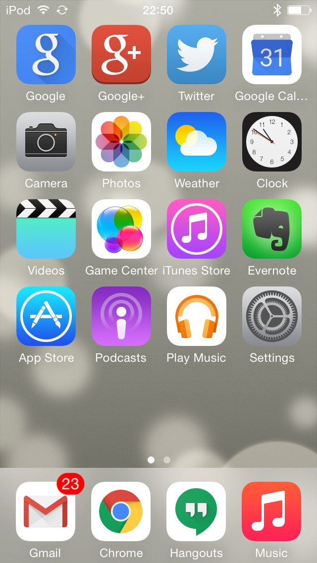
While I'm on the subject of the famous great design of the Mac... what's up with the business of seeing the time format? The system preferences seem very flexible when it comes to setting date and time formats. I really like the dialog that provides this:

Setting the date format

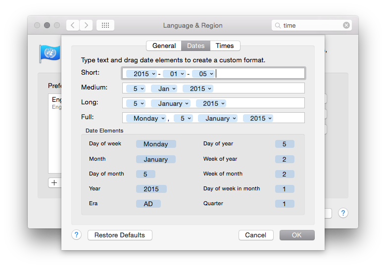
As you might see above, my preference when it comes to date formats is to have everything in ISO 8601 format. Having set that I then noticed that the time shown in the menu bar on the desktop was.... whatever the hell Apple appear to have decided for me!

This is not the date format I asked for

Even Windows lets me set the date format as I want it in the desktop time display. Apple, meanwhile, seem to provide a great method of letting you set your date and time formats "just so" and then they seem to just go right ahead and ignore your preference in the one place you'll see it the most.

If you have a Mac, you have software I wrote on it (I think)

From what I could tell every Mac has a copy of GNU emacs installed, out of the box. That actually kind of impressed me. Sure, it's a rather out of date version of GNU emacs, but it's a copy of GNU emacs and that's all that matters.

It's a GNU emacs!

That fact actually means something rather interesting, to me. See, there's two small packages that are part of GNU emacs that I originally wrote. One is called 5x5, the other quickurl.

My rubbish claim to fame

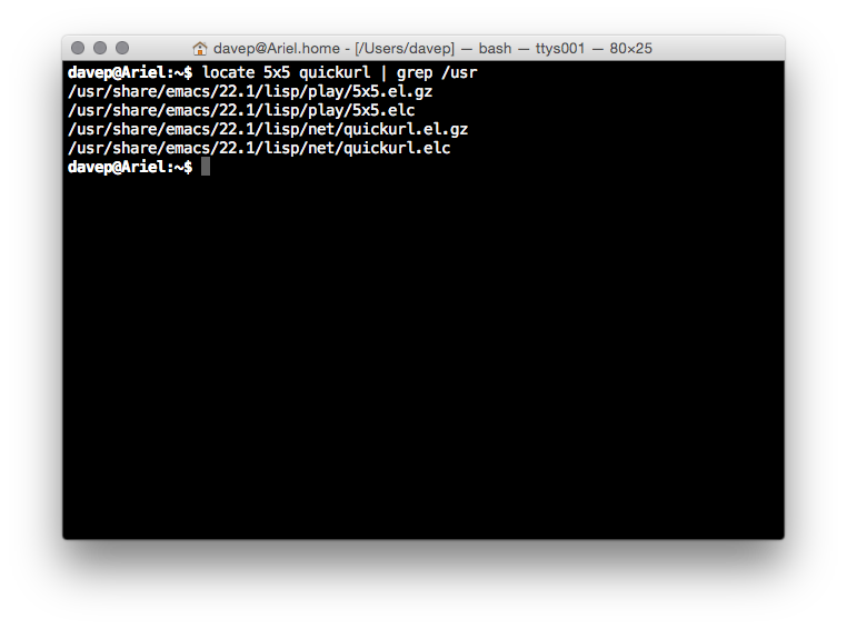
So, yeah, from what I can see, on every new Mac you'll find two bodies of code that I originally wrote, pre-installed.

Yeah, I know, shitty claim to fame. I'll take it anyway. ;)

Overall initial impression

Overall my initial impression is a good one. The Apple iMac seems to make for a pretty good Unix workstation. The keyboard layout could do with some work to make it more friendly to programmers (well, to this programmer) but overall it all makes sense and is easy to navigate.

If most of what you do is actually online then I'd say that an iMac would be a huge waste of money. If you want a desktop machine for web browsing and generally working "in the cloud" then you'd do a lot better to buy a Chromebase (or, of course, a Chromebook if you're looking at Macbooks). On top of this, if most of what you're doing is online but you want to do some client-side stuff such as image/video editing and gaming then I struggle to see how an iMac would be a good choice too. For the money it's hilariously underpowered when compared to a reasonably equivalent Windows PC (or, of course, GNU/Linux machine if what you want to do can be done there).

My own reasons for purchase were about having a desktop Unix workstation that I could install various compilers on so I could muck about and work on some fun projects I want to get done. It was an unusual extravagance that I don't regret and, so far, I've been pleased with.

There's very few people I'd actually recommend one to though as it seems pretty clear to me that, generally, their money could buy them so much more.

But it's a nice new shiny toy. ;)


Wear timer issue fixed, sort of

Posted on 2015-06-26 12:02 +0100 in Tech • Tagged with Google, Android, Wear, Android Wear, Watch, Moto360 • 2 min read

Following on from yesterday's problem with the Android Wear timer I think I now have a solution. It came up while chatting with Mike McLoughlin about the issue.

I got to thinking that this problem felt like one that I've seen a number of times before with Google stuff. One thing that's rather common (in many cases for very obvious reasons -- you can't cover the whole world in one go) with Google is how they struggle to get languages and localisation right. This felt like it was a similar issue. Mike had reported that his watch appeared to be unaffected by the issue (I'm guessing he's on the latest version of Wear -- the conversation headed off in a different direction before that became necessary) so I checked what his language was on his phone. Turns out he was the same as me: British English.

So much for that idea.

But then he suggested switching to US English and back again.

Happy enough to apply a very Microsoft "turn it off and on again" approach to a Google device (really, all big tech companies really are the same and really do suffer the same issues) I switched to en-US on the phone and tried setting a timer in voice on the watch.

It worked!

So then I switched back to en-GB on the phone and...

I appear to have timers working again

...it still worked!

I've tried setting timers in voice on the watch a few times since and it's yet to fail.

It would appear, as odd as it is, that this is the fix. Well, a fix.


Did Google just break Wear timers?

Posted on 2015-06-25 22:27 +0100 in Tech • Tagged with Google, Android, Wear, Android Wear, Watch, Moto360 • 2 min read

I didn't pay too much attention to it when it happened but it looks like Android Wear, on the phone side, got an update in the last 24 hours. Only this evening did I notice that this seems to have broken something I heavily use on my watch: timers.

I find the timer facility on Wear especially useful when I'm cooking, either to ensure that different parts of the cooking process come together at a sensible time, or when I put something on and need to go off and do something else (perhaps come back to the office while and get on with some work as something bakes, etc).

To be clear, the timer app is still there and, if I select to start a timer "by hand" on the watch, it works as it always has done. Also, if I say "OK Google, set a timer for five minutes" it still does the voice recognition thing:

Google still understands the request

It's what happens next that's the problem. Before it would have started a countdown timer. As well as vibrating the watch when the timer runs down the timer app also has the very useful feature of showing the countdown on the watch face. This means you can glance every so often and see how long is left to go.

Instead, as of today (well, this evening when I made dinner was when I first noticed it), it starts an on-watch alarm app instead! This is utterly useless. Sure, it does still vibrate the watch when the alarm time arrives, and the alarm time is the right offset from when the timer was requested, but it lacks the on-face countdown.

It's an alarm.

It's not a timer!

Looking in the Wear app it would appear that the correct application is assigned to the correct action:

Google still understands the request

As such, I'm at a loss on how to fix this. I can't find anything on the watch itself that could be done to change this, and I've tried restarting the watch on the off chance that something went a bit odd.

It turns out too that I'm not alone. I found a thread on reddit where others have the same problem.

What really bugs me about this is that this is very Google. I've run into this sort of thing so many times before, be it on Android, ChromeOS or in their apps in general. They'll change (or screw up) something that's very simple and straightforward and in common use, something that should show up in testing pretty easily. Surely there has to be some way of pushing out an update without screwing up the apps that are assigned to actions?

As much as I really like what Google offer, as much as I value their services and global platform over the other choices, this sort of thing frustrates the hell out of me.


Medium login on Android and iOS

Posted on 2015-06-25 15:39 +0100 in Tech • Tagged with iOS, Android, Medium • 2 min read

I woke up this morning to find that one of my more recent favourite websites, Medium, had finally released an Android application. I'm more of an avid reader than a writer on there (I've only ever written 2 articles on there, and have toyed with the import facility too) so I imagine the app won't make too much of a difference to me, but it was nice to see that something that had been iOS-only was now on Android too.

I installed it on my Nexus 7 and Nexus 6 and then, given that I have an iOS device now, I installed it on that too. In doing so I noticed a very curious difference:

Medium login on Android

vs:

Medium login on iOS

Notice how Android has Google as an option whereas that's not an option on iOS? The curious thing is, when I installed it on my Android devices, I logged in with my Google account and it all just worked. I was into my account, there were the sorts of stories I'd be interested in, and there were the couple of stories I'd written.

On iOS I logged in with my Twitter account and the same thing happened (I don't use and don't have an account on Facebook).

It was than that I had to think about how I even logged into Medium normally (via the web, which is what I'd always used up until now). Seems I'd always used the Twitter login (which would make sense).

So here's the thing that's got me wondering now: when I logged in with my Google account, how did it make the connection to my Twitter account? I mean, sure, there's got to be enough data kicking around to actually make the connection and it seems like a safe enough one to make but... huh? I must be missing something here though, it's as unexpected as it is handy.

It's also worth noting that if you go to log in to the website Google accounts are not an option (there is a sub-option for "Android Users" where you have to create an account based off your email address, from what I can see).

I'm left trying to decide if I missed a step here, if this is clever, or if this is just plain creepy (and who's responsible for having made the connection).

Edit to add: Cara from Medium was kind enough to notice my tweet pointing to this post and let me know the how and why of the above. Turns out it's what Rich suggested in the comments.


And now for some iOS

Posted on 2015-06-23 23:09 +0100 in Tech • Tagged with Mac, Apple, iOS, iPod • 3 min read

I'm on a bit of a "explore other universes" trip at the moment, it would seem. The other weekend I finally cracked and purchased my first ever OS X device and, earlier today, I purchased my first ever iOS device.

Don't worry, I'm not abandoning the world of Android; far from it if my experiences of iOS so far are anything to go by. However, having started slowly working through a book that teaches Cocoa and Swift I thought it might be interesting to be in a position, at some point in the future, to be able to make and throw an app at an iOS device and it seemed the most affordable way of doing that was to grab an iPod.

So I did.

I now own an iPod

One of the first things I did, and I'm glad to find it was possible, was to load it up with apps that make it into a reasonable Google device (so, so far, I've got Gmail, Google+, Google Calendar and Google Music on there -- need to sort Google Drive too, at least). Next up was to get some music on it too -- might as well actually use it to listen to music, I guess.

That actually turned out to be more fun than I was expecting. See, I gave up on iTunes many years ago, back when it was pretty much the only legit method of buying music online. Since then I've tended to work with ripped copies of my CD collection or I've listened to music I've bought on Google Play (the latter bulked out with the former thanks to Google's music uploader).

And here's the fun part: if you use the recent Google Music Chrome app (which, it seems, allows unlimited downloads of your albums) to pull the music down, and drop them into iTune's import folder, magic happens and iTunes gets nearly populated with music. Even better, music that I'd originally ripped as WMAs comes back own as mp3s, so solving the problem of iTunes not doing WMAs.

Handy!

So, anyway, that's the iPod set up as a generally useful device.

As for iOS itself.... Ugh. I'm far from impressed. Compared to Android it feels old and clunky and very constraining. For example, I can't really control what's on the home page. Sure, I can move things about, and I can even remove apps I've installed, but I can't remove/hide Apple's own apps at all. The best I've managed to do is drop all of them in a folder together and ignore that folder.

I'm finding the whole navigation thing kind of frustrating too. The lack of a standard back button -- as you have on Android -- means that different apps seem to do different things in terms of allowing back navigation. I'm also still unsure how you can easily task switch (if there is a way of doing that it's not obvious to me).

Another thing that's frustrating me is "AirDrop". I tried to use it to get the screenshot you see above onto my iMac but nothing I did would make it work. The iPod would see the iMac and the iMac would see the iPod but the filed didn't appear to want to move at all.

Yet another thing that seems rather unstable is the whole business of WiFi sync. That seems like a sensible idea -- let iTunes on the Mac know that the iPod lives on the same network and have them sync that way. Problem is that I'm finding that it drop out during a sync more often than not. The only reliable method of doing a sync that I've found is to use the USB cable.

I've yet to write the blog post about my experiences with the Mac so far but what I'm finding here fits in with what I've found with the Mac: some of the ideas are really rather clever but they just don't quite work as well as people would seem to want to have you believe. Apple gear has this reputation of "just working" and I'm finding that this really doesn't seem to be the case at all.

Still, it's all a learning process and I know far more about Apple gear now than I did a week or so back, and I'm learning more as I go.


ChromeOS file manager got better

Posted on 2015-06-22 17:04 +0100 in Tech • Tagged with ChromeOS, Chromebook • 2 min read

The ChromeOS file manager has always been a bit.... rubbish. Kind of. Back in the very early days it only let you work with the Chromebook's (very small) local file system. Then, some time later, they added Google Drive integration, which was seriously handy. But it still lacked some important stuff, like the ability to mount filesystems from Windows machines, or to use sftp, or the like.

That seems to have all changed with the addition of the "Add new services" button:

Now I can add more stuff!

As is often the way with Chromebooks, unless you're closely following forums or Google+ communities (I don't), you tend not to know when this stuff is going to turn up or even when it does (I mean, really, is it too much to ask that the device alert you to handy new features? I mean, my watch did!). For all I know this has been there a while and it's the first time I've noticed.

No mater how long it's been there, it's really rather handy. I've already been able to hook it up to my Dropbox account, there's an SMB filesystem handler (that I've not had a chance to test yet) and an sftp service (which I have tested and seem to work well enough for my needs). There's more too:

Handlers for all

I'm guessing there's an API out there now that people can work with so I guess the list of services you can install will grow over time.

For people who want to do a little more than just browse the web, Chromebooks (and other Chrome* devices for that matter) just got a little more useful.


A ChromeOS issue

Posted on 2015-06-21 20:05 +0100 in Tech • Tagged with ChromeOS, ChromeBook, Samsung • 2 min read

Since the last update I've being having a rather odd issue on my old Chromebook. This is my Samsung Series 5, the "original" commercial Chromebook to be released (in the UK anyway). I first noticed it in TweetDeck but have since noticed that it's affecting any browser tab. Simply put, sections of the display either "lag" in their content or they simply show up empty.

First I tried to get a screenshot of what was going on but it didn't work. I did get to show that there was a problem, but what was grabbed by the screenshot wasn't what I saw seeing on the screen. Here's the screenshot:

Screenshot of new ChromeOS issue

The only way I can show how it looked to me on the screen is with a (rather horrible I'm afraid) photo:

Photo of what the screen actually looked like

It's unclear to me if this is something wrong with the Chromebook itself, or in this release of the OS. It is running the beta channel -- currently on 44.0.2403.54 -- so, of course, this sort of thing is to be expected.

If it is the case that that Chromebook is on its way out -- either in terms of that actual machine dying or support for it at the OS level going away -- it won't be a terrible loss. It's been a great machine and has served me well and wasn't terribly expensive to begin with (the lack of expense is one of the things I really like about Chromebooks, which is why the Pixel continues to perplex me), replacing it with one of the newer crop of Chromebooks won't break the bank.

But I'd be a little sad to see it go, I've done some pretty significant things on it and it is, in some ways, a little bit of computer history.


Edit to add: I've now moved it back over to the stable channel, with a powerwash on the way (of course) and this seems to have done the trick. I'm no longer seeing any problems. The switch to stable even had the problem showing. Here's a video of stable downloading:

That's pretty much the sort of thing I was seeing all over the place, and it appeared to be getting worse as time went on.

Hopefully this was a one-off and the problem isn't simply up in the beta cannel and waiting to head down to stable.


Moto360 updated

Posted on 2015-06-20 14:14 +0100 in Tech • Tagged with Android Wear, Moto360, Android • 2 min read

Yesterday evening I finally got the following notification on my Moto360:

Moto360 Update Notification

Given the charge was quite a way below that I took the watch off and put it on charge and then did the update later.

From what I could tell it all went pretty smooth. After updating it even offered me a little tutorial on some of the new things it's added. So far I've used (or set up) the following:

  • The much better "launcher" Finding and running apps on the watch was always a bit of a pain, so much so that others had even written special launchers for Android Wear. This seems to be pretty much solved now. Pressing and holding the watch's side button will pop up application list, from here you can swipe right to your contacts (them letting you send messages, start calls, etc) and right again for the usual list of actions that you used to go straight into.

The way it's done now makes a lot more sense and seems far cleaner.

  • WiFi I've yet to notice the benefit of this, but I've not paid too much attention yet either. The watch now does WiFi. This is supposed to mean that it can still work with my phone when it's out of Bluetooth range. I say I don't know if it's working yet because I use an app to tell me if my phone is out of range and it still keeps tripping as normal -- but I'm unsure if that means it's simply telling me it's out of BT range but really the watch is now doing its thing over WiFi, or perhaps the phone connection really has been lost despite me having set up the WiFi connection. More testing needs to happen here.

Setting this up was curious: I had to turn it on on the watch and then select the access points I wanted to work with, again on the watch. But to actually connect I had to switch back to my phone to enter the AP passwords (which makes perfect sense of course, nobody wants to type passwords into a watch face).

  • Gestures These needed to be turned on in settings. I've being using them this morning to navigate cards on the watch and it's really well done and really natural. Simply put, you flick your wrist up, or down, to "flick" from one card to another. All it seems to be missing is some method of gesturing that I want to swipe a card out of the way.

Other than the above it's pretty much business as usual. Hopefully there's been some work to improve battery life and all that sort of stuff, and only time will tell if a difference has been made there.


ChromeOS ssh has gone! (sort of)

Posted on 2015-06-19 09:10 +0100 in Tech • Tagged with chrome, chromeos, chromebook, ssh • 1 min read

I've no idea when this happened, and I'll admit that the advice it gives is advice I've mostly being following anyway for quite a long time, but it seems that ssh in the ChromeOS terminal has been removed. This is what just happened when I tried to use it just now:

ChromeOS ssh no longer working

To be fair, Chrome Secure Shell is pretty damn good and has served me well for the past couple or so years, working well on the Chromebook and on Windows 7 and 8 (and also now on the Mac, although I'm tending to use ssh in its native terminal more).

I wonder if any other of the limited features of the ChromeOS terminal (in non-dev mode anyway) are going to go the same way?


As an aside to the above, something kind of ironic happened as I was writing this. I opened Chrome so I could preview the post as I was writing it and I suffered one of Chrome's rather common extension crashes. Look what one of those extensions was (and I wasn't even using it at the time):

Chrome ssh extension crashes for no reason

Not exactly the best advert for the non-optional replacement.


A mild Chrome annoyance

Posted on 2015-06-18 16:49 +0100 in Tech • Tagged with Google, Chrome, Mac, Windows • 2 min read

For a long time now Chrome has been my web browser of choice. It has, to some degree, become my "other emacs" (ignoring for a moment that my use of GNU emacs has sort of lapsed the last few years). By that I mean that it's a portable environment that serves me well on many operating systems and, for one of my machines, actually is the operating system. I really appreciate how Chrome's sync lets me feel right at home no matter which machine I'm on.

But I've run into one small issue that's kind of annoying.

In some situations I find it pleasing, and I find it makes sense, that some web "apps" open in a window of their own rather than in a Chrome tab. On Windows and on ChromeOS this is simple enough, all I need to do is find the "app" in the Chrome app launcher, pull up the content menu, and tell it to open as a window.

Chrome app context menu on Windows 7

Nice and simple1.

Now, the Mac, so well known for doing everything every other OS does but doing it better and being easier to use.... you'd expect it's at least the same there, right?

Nope.

Chrome app context menu on OS X

There's no option at all to open as a window!

So, on the Mac, while I'd love to be able to open Gmail as a window/app in its own right, I'm totally out of luck, it seems. I've no idea whose "fault" this is. It's not clear to me if this is a Chrome/Google decision or if it's about how things have to work on a Mac. Thing is, I find it hard to believe that it's the latter given that Google Keep runs in its own window on the Mac and I can happily pin it to the dock.


  1. It's that simple on ChromeOS too. In case you're wondering why I didn't also illustrate that, it's because you can't take a screenshot on ChromeOS while you've got a context menu open. O_o